Best Colour Combinations For Your Interiors
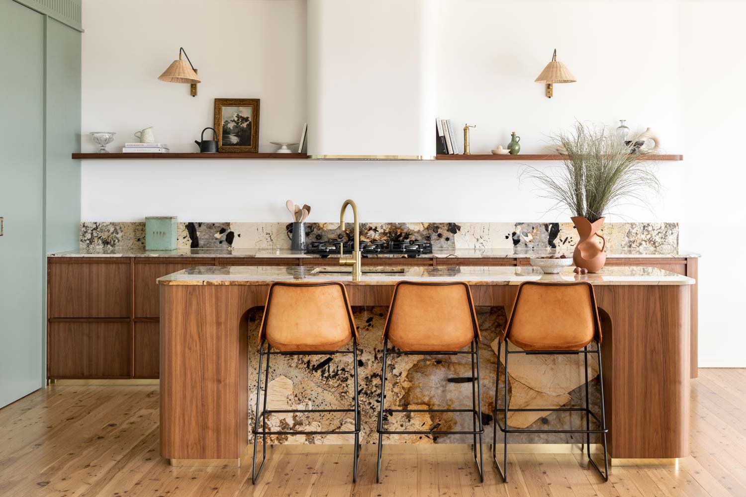
Your home is your territory, and while it’s natural to want to personalise it, choosing the best colour combinations to align with your interior design tastes can be intimidating. Gaining some understanding of colour schemes helps refine your choices so you can focus on creating the look that turns your house into a home.
To ease into interior colour-matching, we speak to a slew of stylists and interior design experts about their approaches to interior design, where to begin, and how matching your scheme with your fixtures helps define your spaces.
Where to Begin With Colour-Matching Ideas
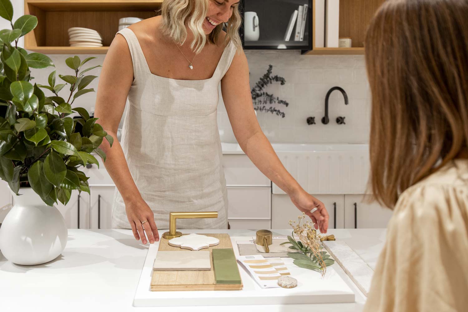
While it’s easy to get overwhelmed by how to match colours in interior design, particularly with all the social media inspo out there, sometimes it’s a matter of getting things into perspective first to achieve a more optimistic approach.
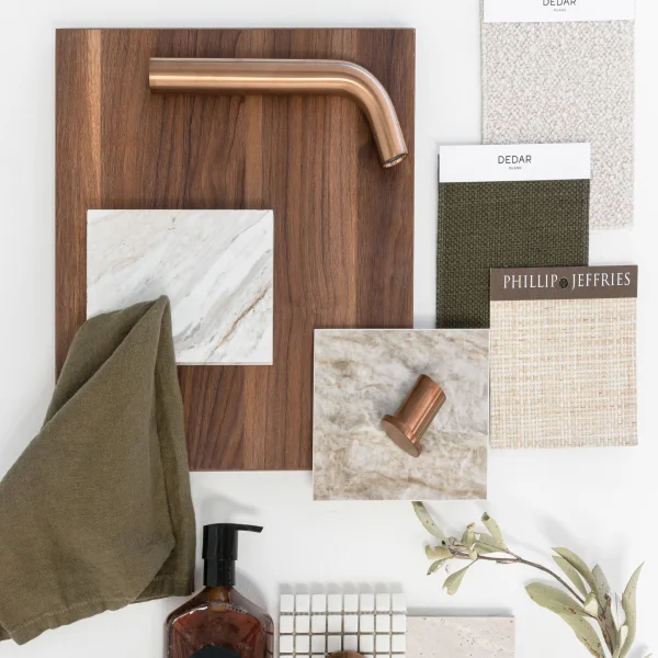
“I like to think of the mood I am trying to create in a home as well as looking at the style of the home itself and get an idea for what colours will work best and then create a moodboard,” recommends stylist, renovator, and former The Block contestant Tash Pavlou. “I also like to choose a primary (feature) colour and then two secondary colours and work from there.”
Tash recommends getting familiar with the colour wheel — noting that colours that sit next to each other on the wheel are complementary, and those that sit opposite each other correspond well.
Clarity is certainly crucial when interior colour-matching. Less is often more, allowing you to add nuances and personalise your space progressively with greater confidence and ease. Alexandra Guglielmino, in-house Interior Designer and Trade Manager at Bluethumb, Australia’s largest online art gallery, echoes this technique.
“The easiest way to approach colour matching is sticking to a select palette with complementary colours,” she says. “The more colours you introduce to a space, the more overwhelming and harder it is to achieve cohesive styling. Start with a focal point, such as an artwork, and build your interiors to match by adding one or two colours utilising different tones and textures.”
How to Match Colours in Interior Design
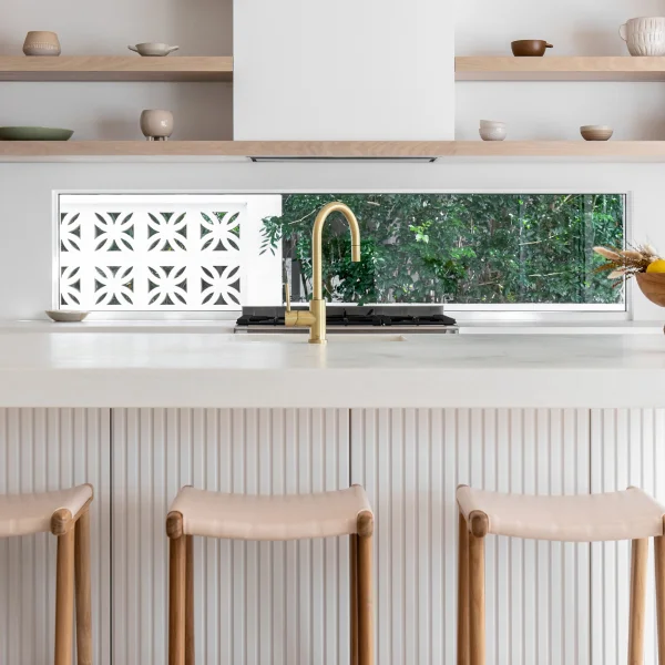
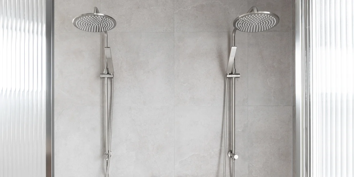
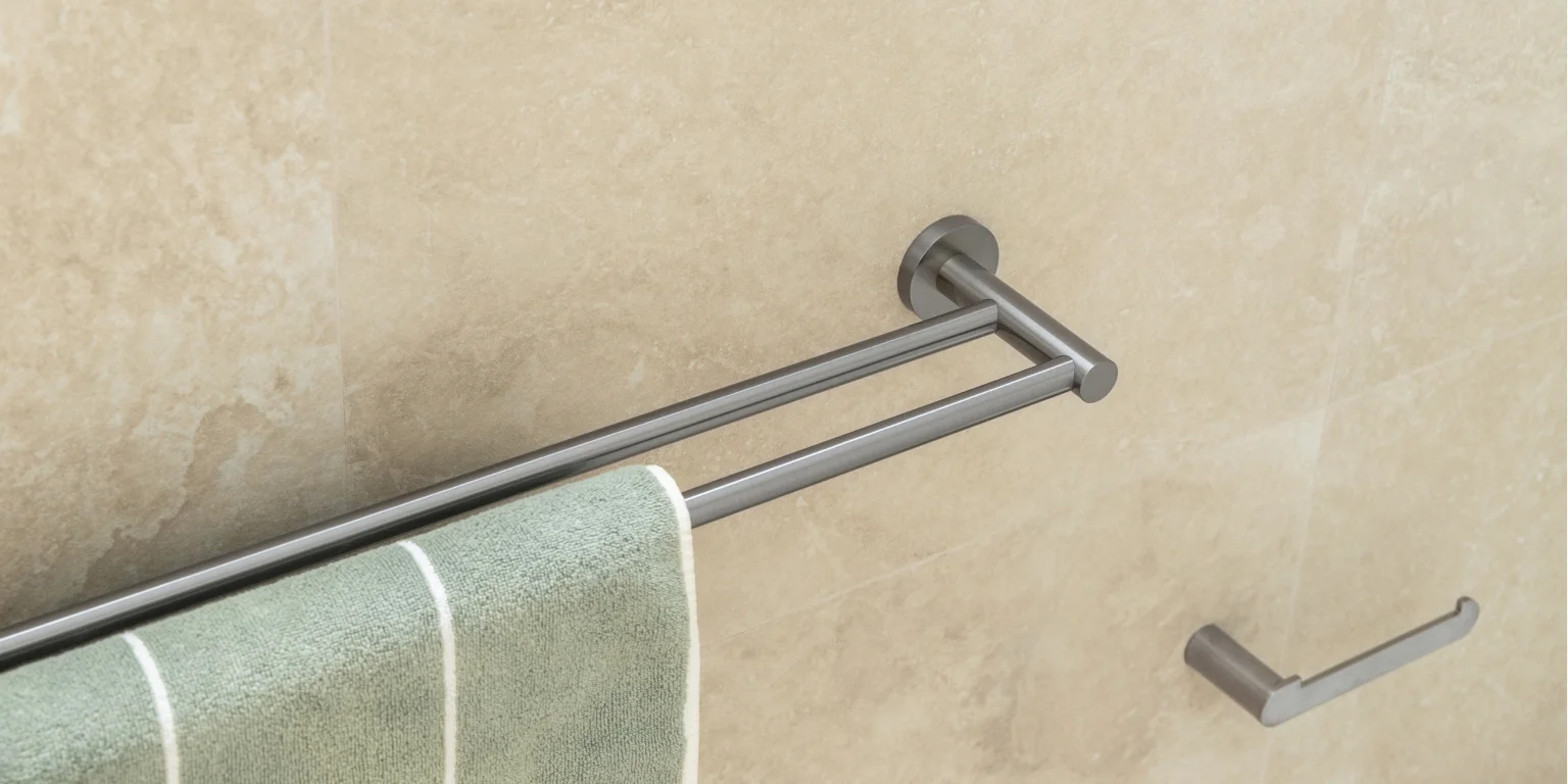
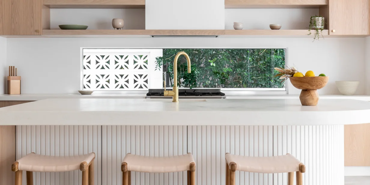
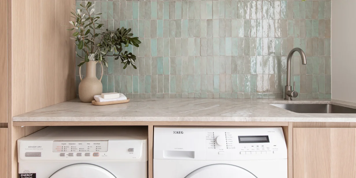
Consider reframing your colour-matching dilemma by learning how to match colours in interior design with your home’s fixtures. In this case, choosing the finishes of your fixtures first becomes the interior design choice from which other ideas can thrive.
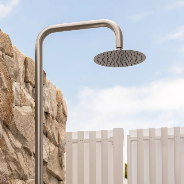
Tash Pavlou believes colour-coordinating your fixtures is often the best way to commence your colour-matching journey. “…especially if you are an interior design novice and unsure how to mix! It can create a subtle connection throughout the house.”


“Where you can have fun and do something a bit different, though, is a kid’s room! I’ve got brushed nickel hardware throughout my home, but in my son’s room — we painted his wardrobe doors green and installed beautiful wooden cabinetry handles to fit into the whimsical theme of the space.”
“When it comes to fixtures, the same rules apply [when] selecting an artwork for a space — carrying the same material, finishes, and colour throughout your interior,” adds Alexandra Guglielmino. “Matching your fixtures creates a sense of harmony and uniformity.”
How to Colour Match Your Fixtures
With so many finishes to choose from, you may not know where to begin. In reality, it’s simply a matter of refining your colour-matching ideas in line with the look you want to create.
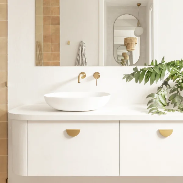
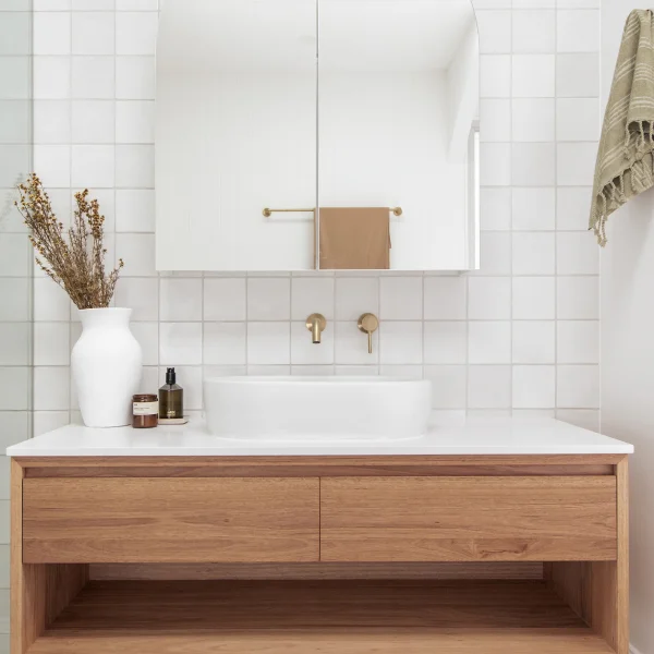
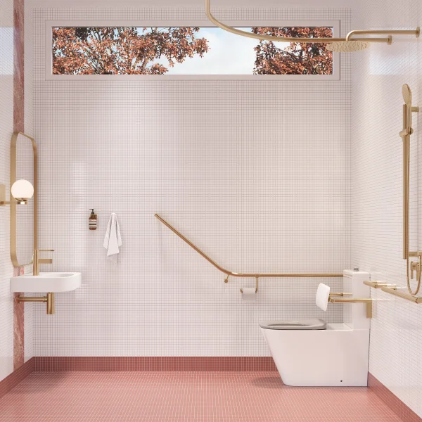
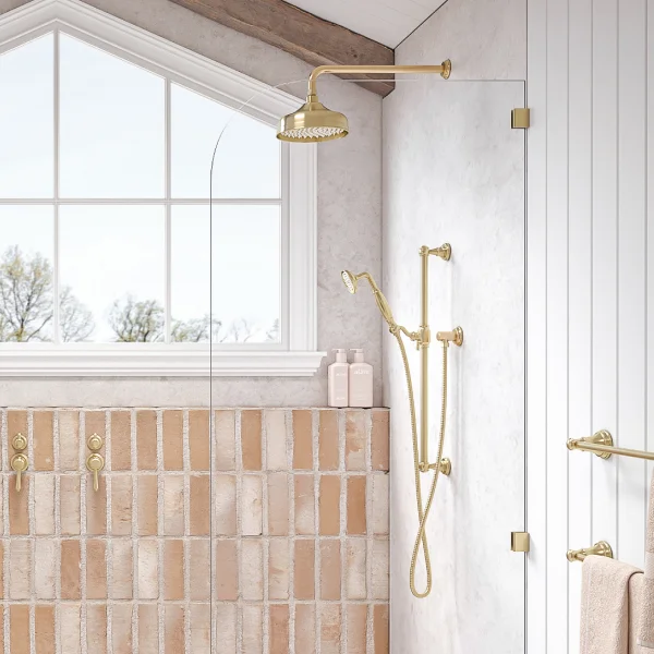
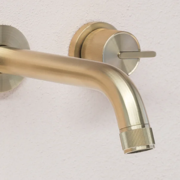
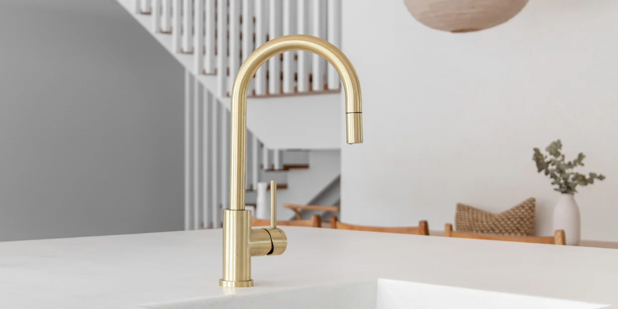
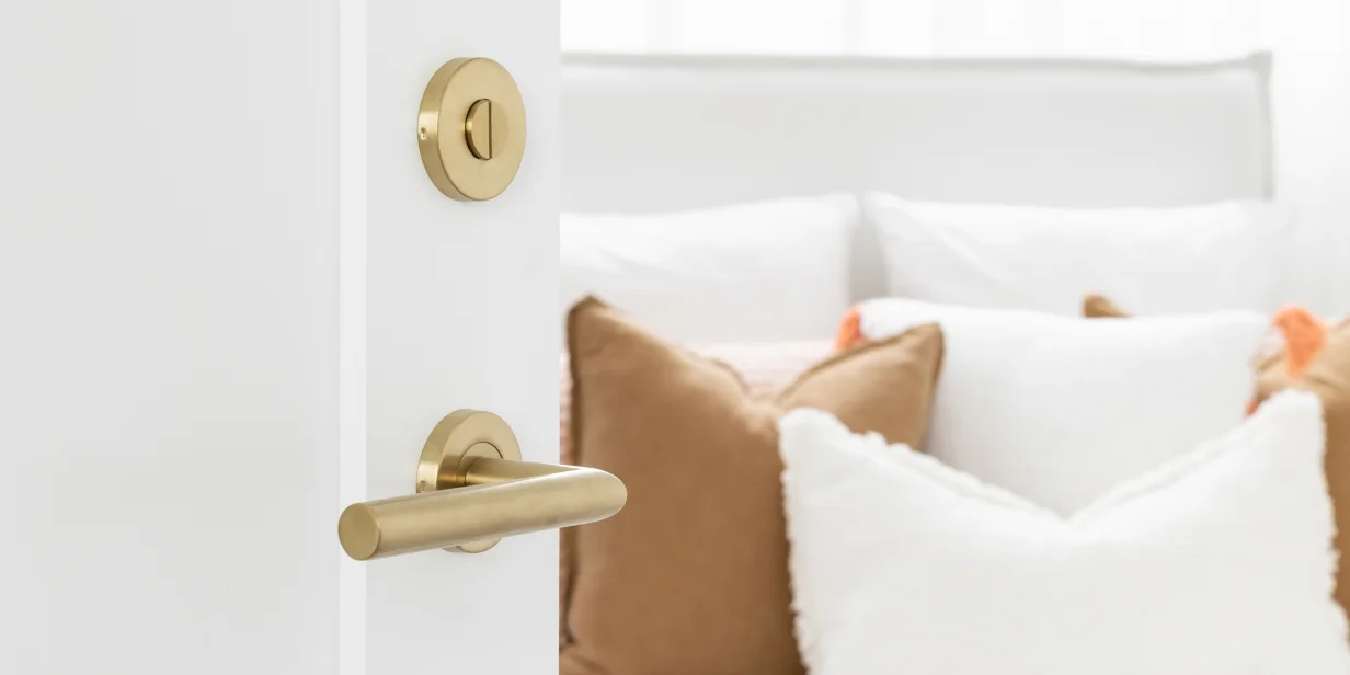
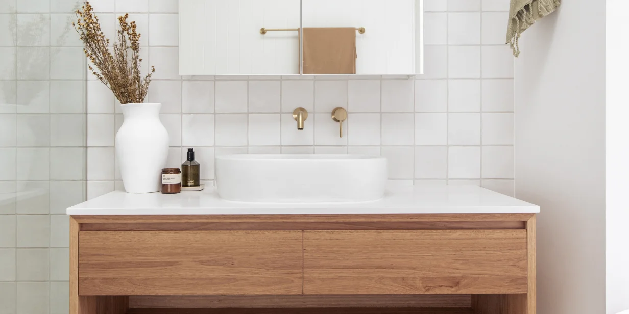
“If you’re after an elegant ensuite, consider using brushed brass tapware and combine it with a vanity top made of marble or marble lookalike with some gold-coloured veins going through. This combination looks luxurious with a white basin and tiles in either black or an earthy brown, and you’re sure to wow your visitors,” says Martina Hayes, an award-winning Sydney-based interior designer.

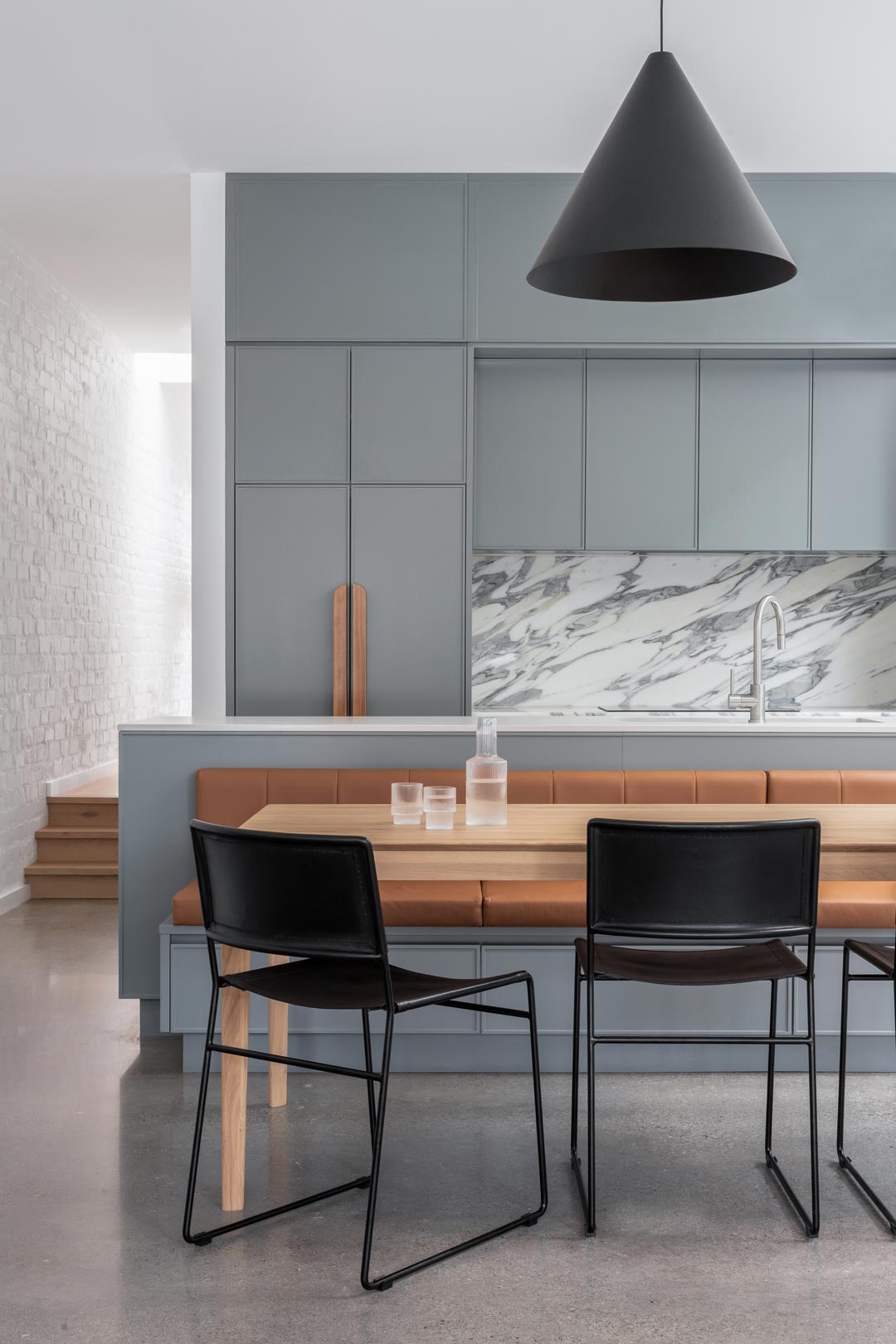
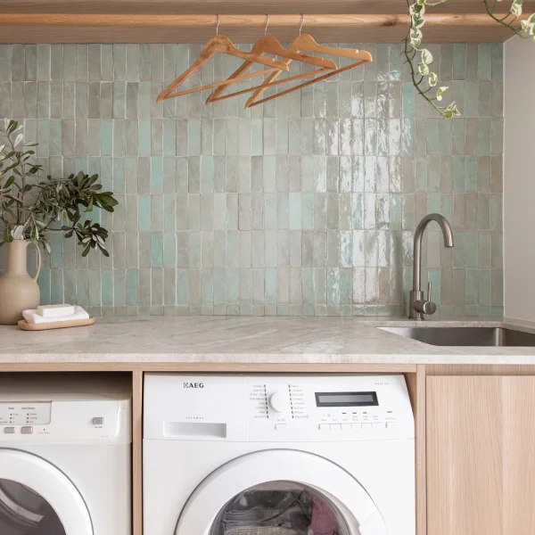
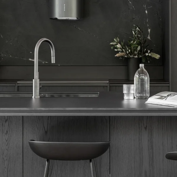
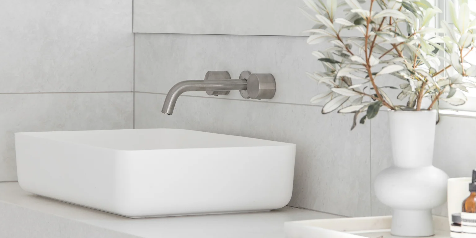
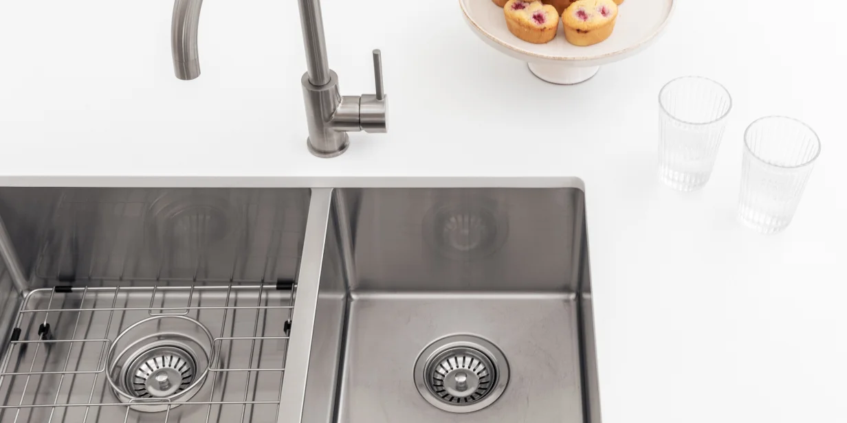
“You can’t go more classic than choosing a kitchen sink in a stainless steel finish which will never go out of style. Pair it with a brushed nickel kitchen tap, a crisp white benchtop, and cabinets in a light blue colour such as duck egg for a Hamptons-inspired kitchen.”

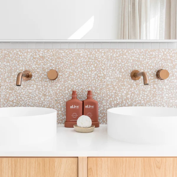
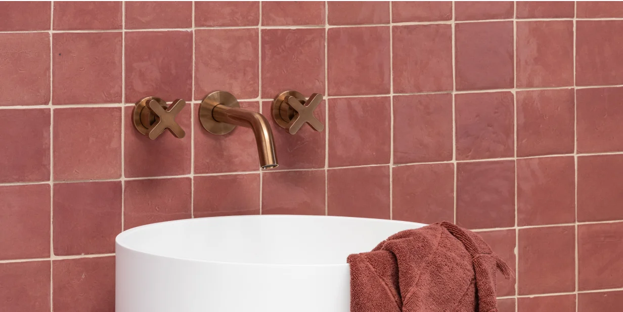
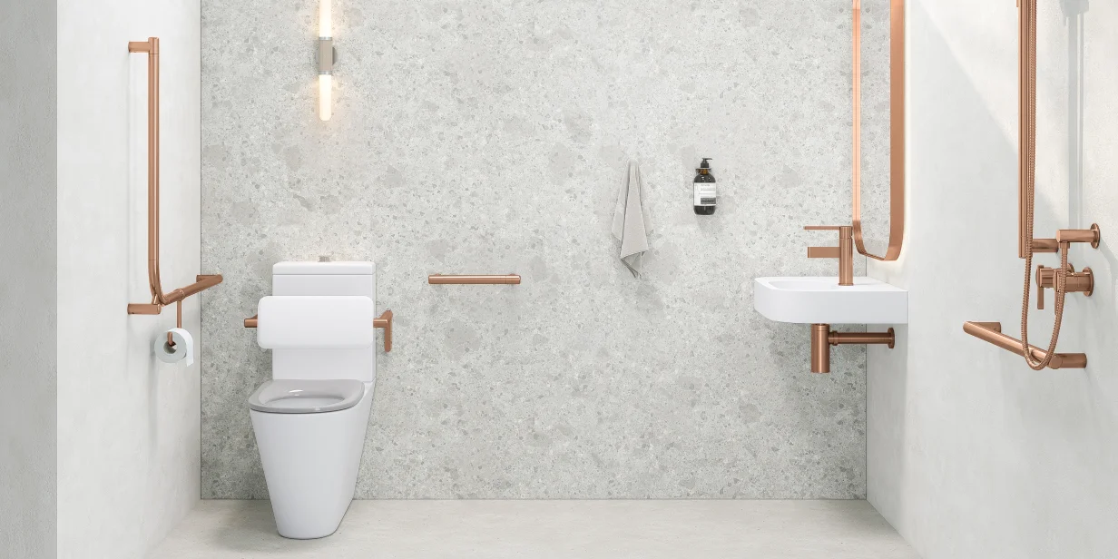
Hayes says brushed copper is her favourite finish for bathroom fixtures due to their warmth and casual luxury. “Combined with charcoal tiles and a dark vanity with a black above-counter basin, it creates a dramatic look, turning your bathroom or ensuite into a stunning sanctuary everyone will admire,” she continues.

However, she also acknowledges the cleansing power of white fixtures, particularly when paired with bright, bold colours and how matte black tapware can create an equally powerful look.
“Can you imagine a feature wall with a squeaky yellow tile while everything else is crisp and white? This look, also known as Californian style, puts a smile on your face every time you enter and is also a lovely colour palette for any kids’ bathroom,” she says.
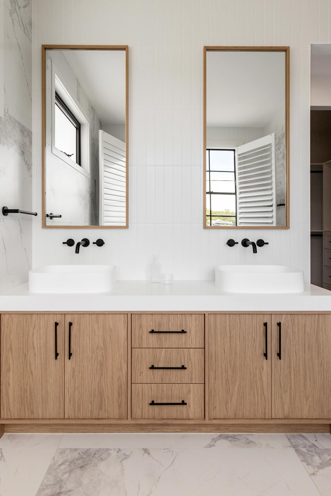
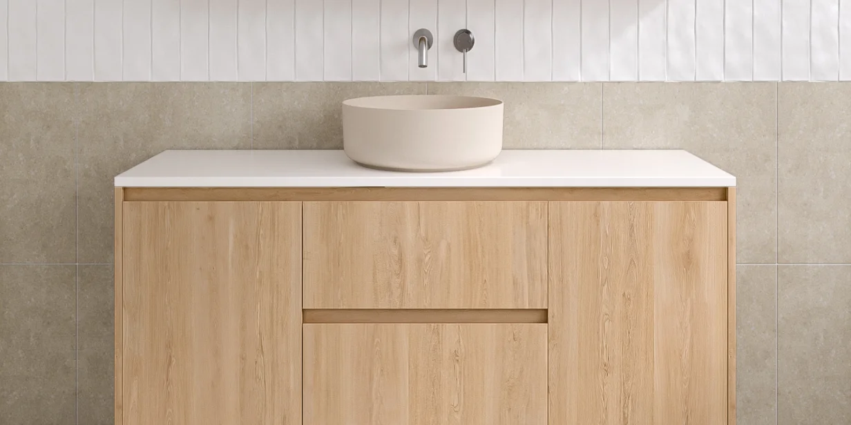
“Matte black tapware paired with white tiles and a white vanity creates a clean and strong statement bathroom. Use this as a canvas to add accessories in any colour; think hot pink towels for a vibrant look, navy blue accessories for sophistication or emerald green for extravagance to complete this classic black-and-white scheme.”
Personalise Your Space
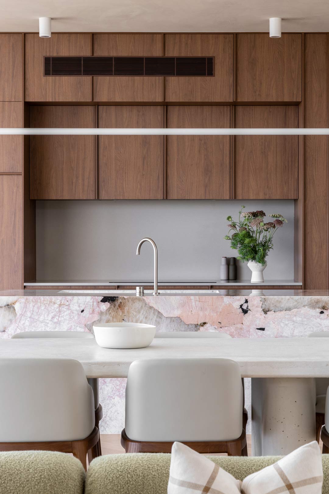
Another consideration for interior colour-matching is deciding whether to follow interior design trends or to evoke more of your personality into your space.
“This really is a personal choice and depends on the project,” says Pavlou. “If you are designing your own home, then you want your personality to shine — this is your comfort zone and where you spend most of your time, so inserting your own personality is what will do that.”
“If you are designing a home to sell or for someone else, then following trends is a great thing to consider, [however], also keeping in mind the style of home and ensuring that your choices will be timeless and won’t date.”
Plenty of informative advice for those embarking on the interior colour-matching journey. For more insights on interior design, check out these blogs:
Welcome the Sun With a Yellow Aesthetic








This was so easy to read! Thanks for the tips.