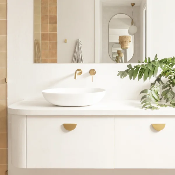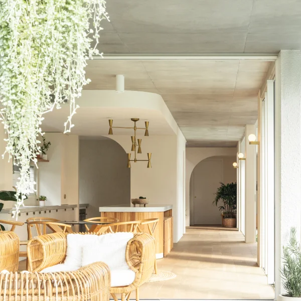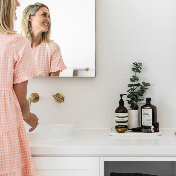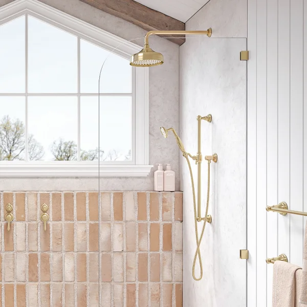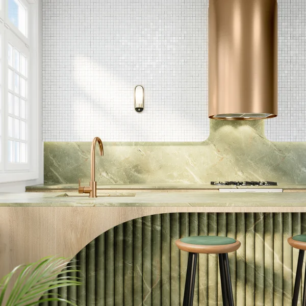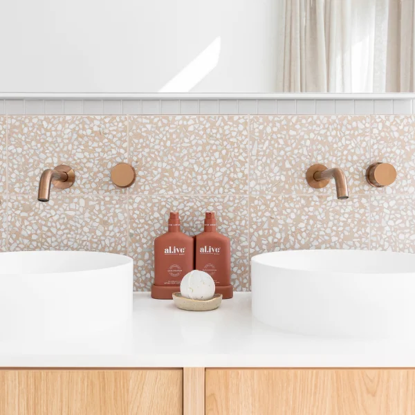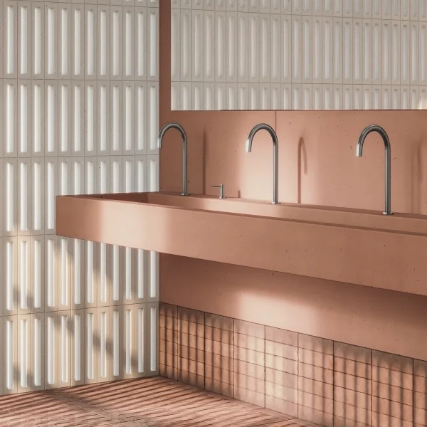
Welcome to Where the Heart is; a Q&A series unveiling the inspiration and essence behind unique and beautifully styled homes. If you don’t already know them from the Block Australia 2019, meet fan-favourites Andy & Deb Saunders. The Wallabi Point dynamic duo consistently dazzled the judges in their season with a remarkable design scheme. The family has since incorporated the beautiful style and a touch of ABI, into their relaxed Coastal home.
Take a peek and see how Andy & Deb styled their home.
Q1. HOW WOULD YOU DESCRIBE YOUR HOME’S DESIGN STYLE?
I think our home is our version of a relaxed coastal style.
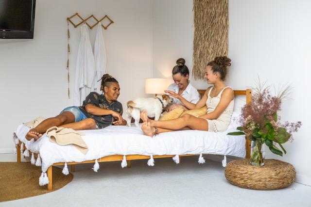
Our home is very close to the beach, you walk down the road for 5 minutes, and you are on the sand. The kids and Andy enjoy surfing; they spend hours at a time out in the ocean – every chance they get. So, piles of surfboards and salty sand-covered bodies are the norm around here! We had to make sure that our home suited our lifestyle and activities, as well as the conditions that come with living near the ocean. Sand everywhere!
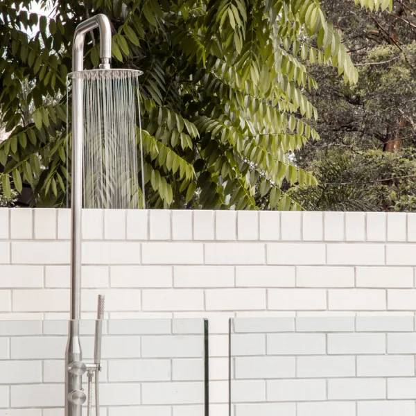
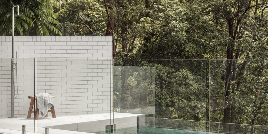
We have timber floors throughout our home so that we can clean up the sand with ease. We also have large covered outdoor areas and outdoor hot and cold shower for the wetsuits and wash up – absolute essentials for our family in this home.
Q2. WHAT ARE SOME THINGS THAT EMBODY YOUR HOME’S STYLE?
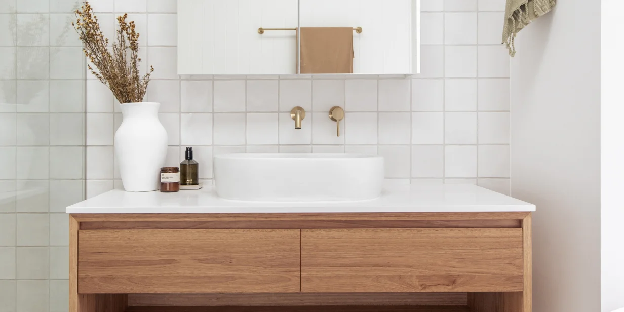
If you watched us on The Block in 2019, it would come as no surprise that we love a light-filled and bright interior. We use timber and white as our base, and from there, add colour, texture and interest through our art, cushions and styling items.
We have used this formula since decorating the very first home we bought together in 2001. We’ve built or renovated six houses altogether, including our Block renovation.
Although our colour and furniture choices have changed over the years, our base concept of timber and white has continued to stay the same.
Our current house has lots of warm tones, woven rattan, textured rugs and cushions – incorporating linen sheers to our windows to soften the space. The art in our home adds colour and detail into each space; we have recently added two beautiful new pieces of art, an Indigenous artwork by Natalie Jade that we love. Andy and our children are incredibly proud of their Indigenous heritage and to have artwork like this one is very special to all of us. The other piece is a beautifully neutral and nude work called Wonderful by Bonnie Gray – we love what these pieces add to our home.
Q3. WHAT INSPIRED YOU TO CHOOSE THE FINISH FOR YOUR HOME? AND HOW DID THAT CHOICE ENHANCE YOUR HOME’S STYLE?
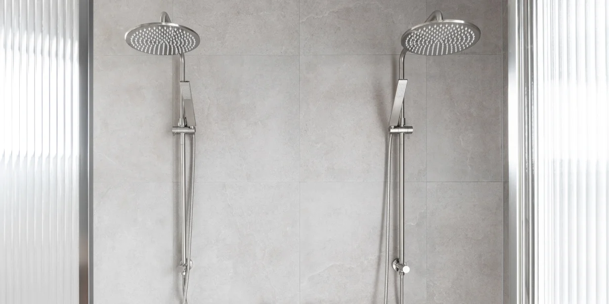
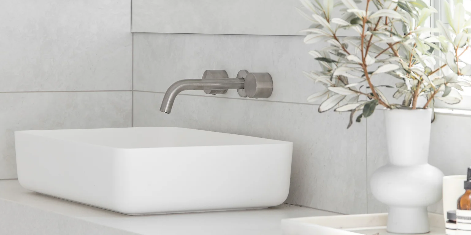
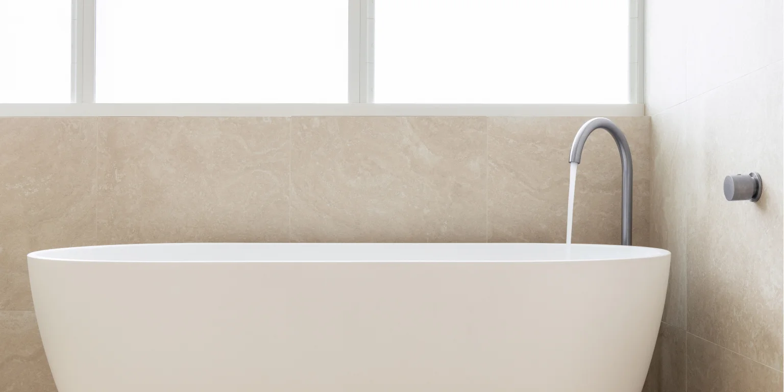
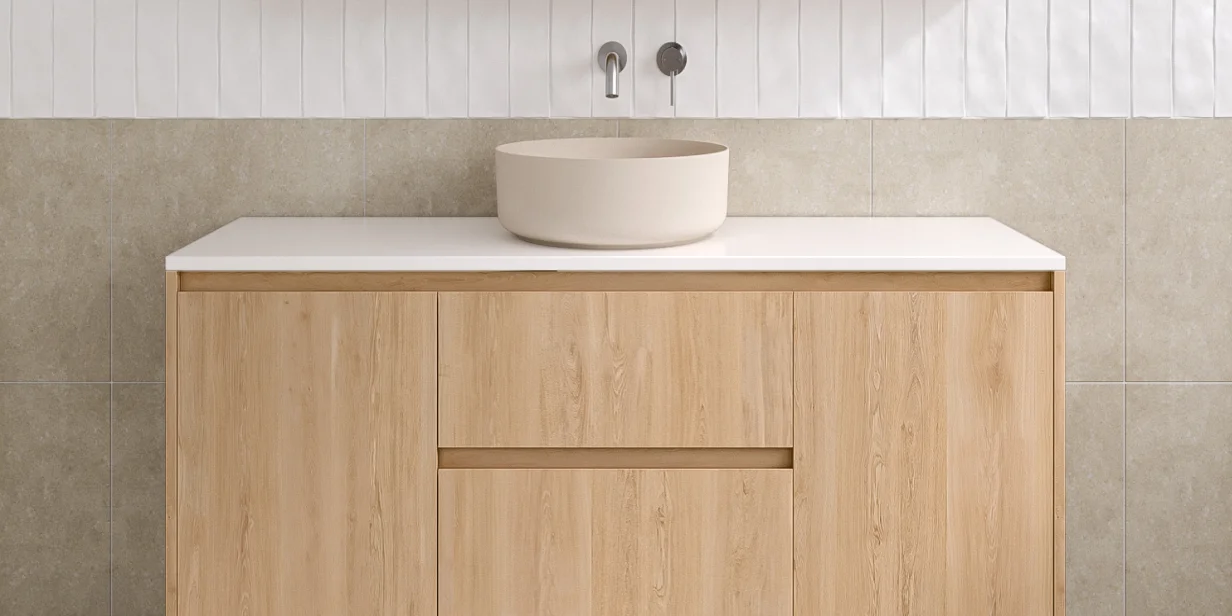
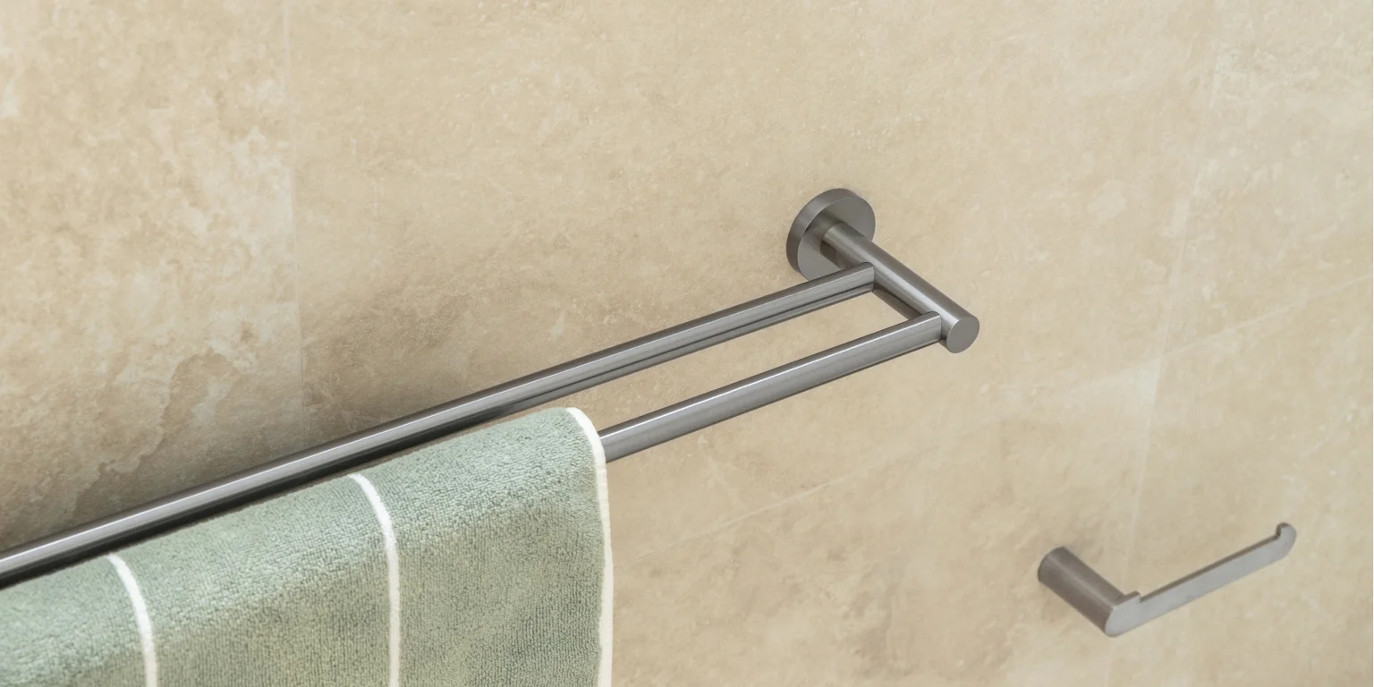
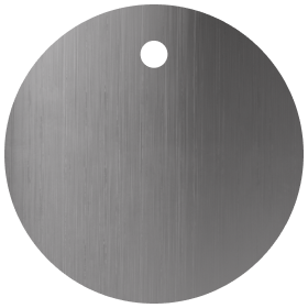
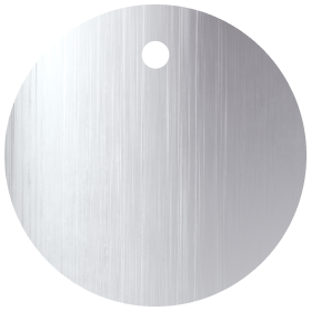
I love how the Brushed Nickel has a soft matte appearance. Laundries and bathrooms are full of hard surfaces so it can be challenging to make them look soft and inviting. I feel like the Brushed Nickel effortlessly achieved this, and worked so well with my other choices. Choosing our tapware was fun as ABI has an incredible variety of beautiful tapware. Hard to go wrong!


Q4. WHAT WAS IT THAT INSPIRED YOU TO PURCHASE ABI PRODUCTS?
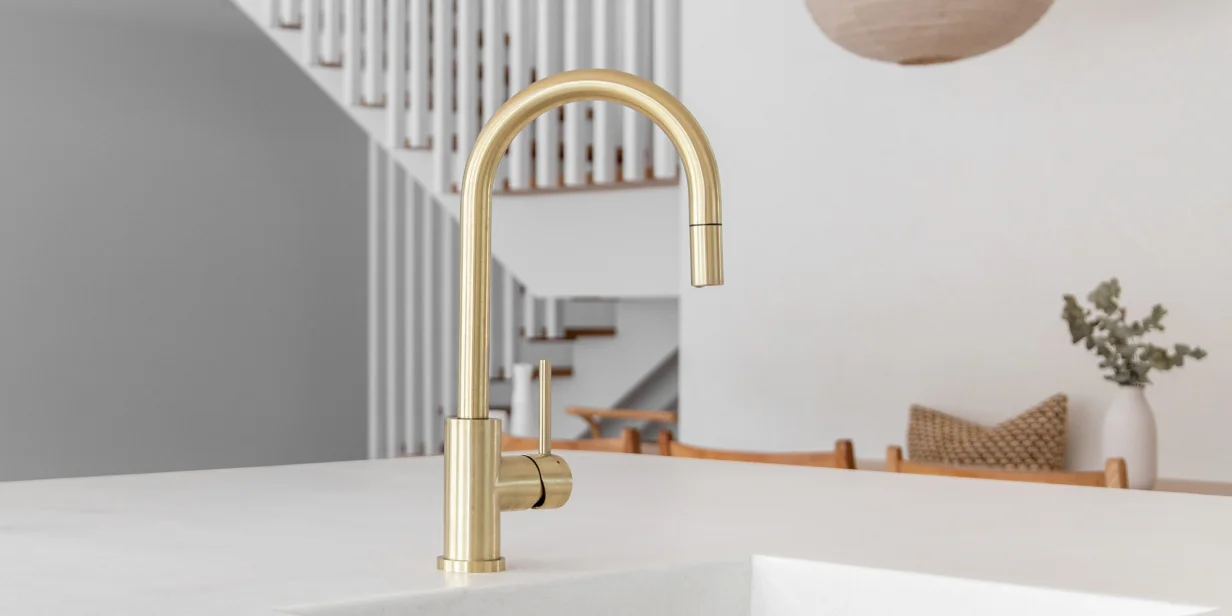
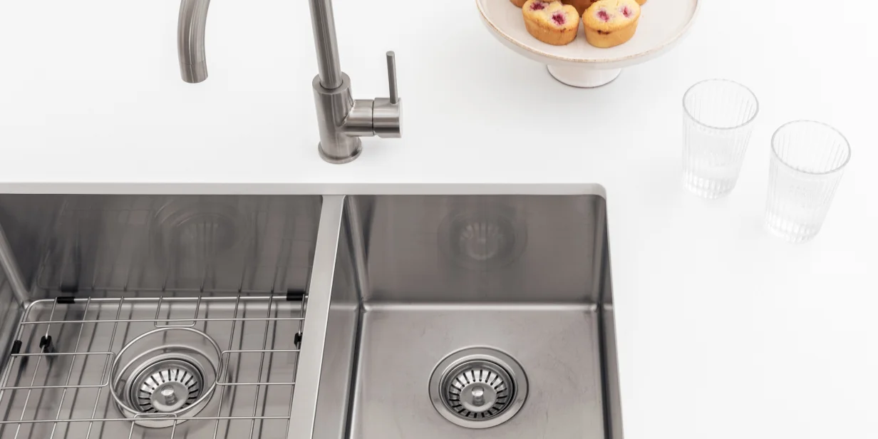
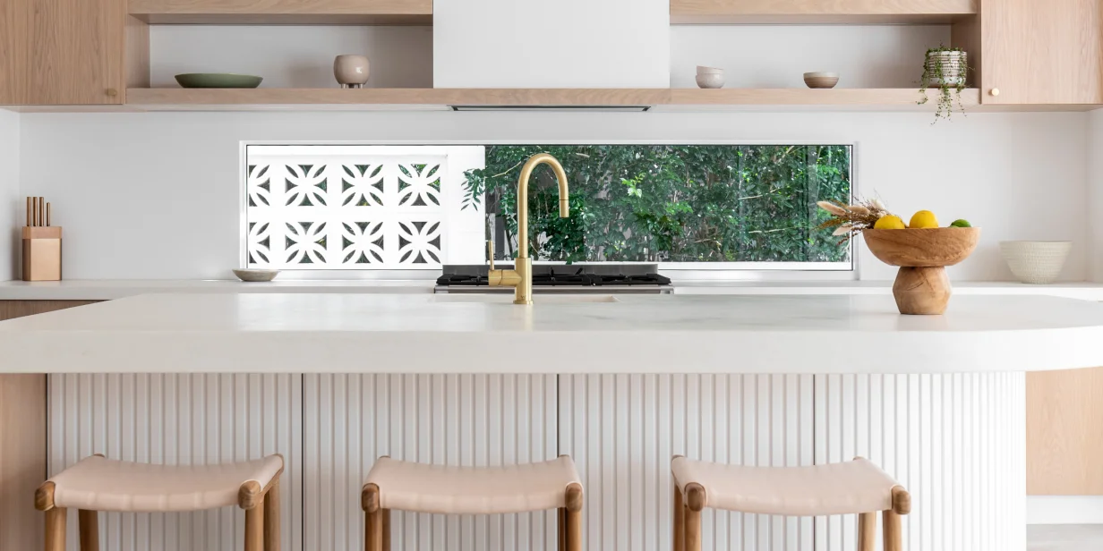
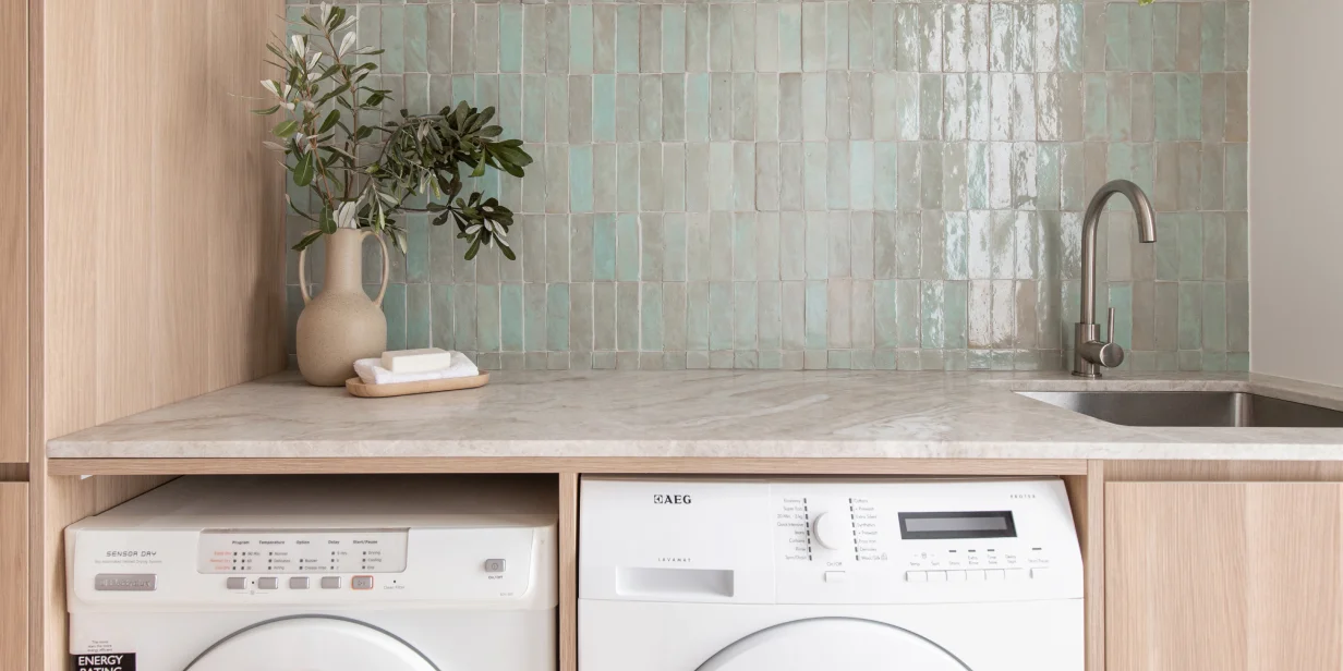
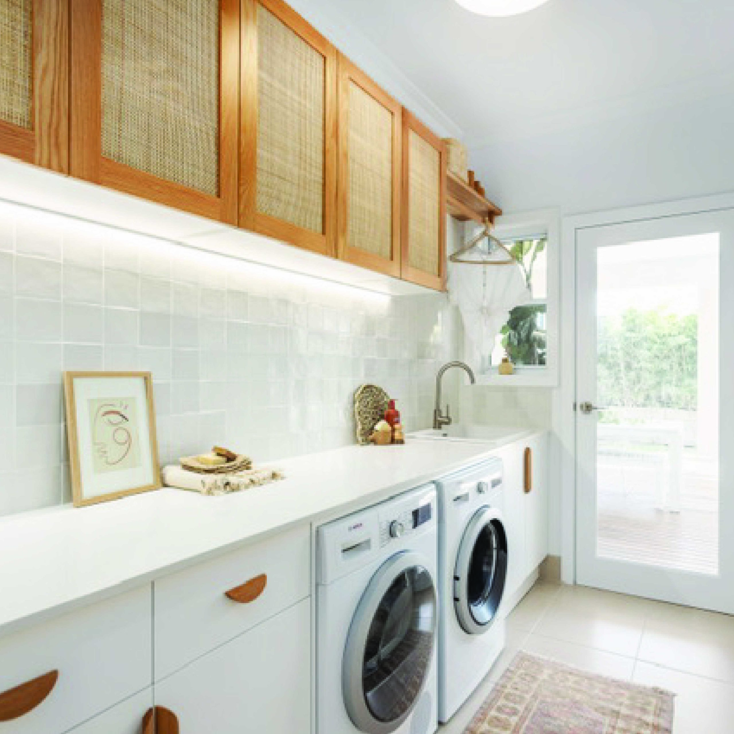
I chose the ABI Elysian Kitchen Mixer for my laundry because I loved the elegant curve of the gooseneck style spout and its colour. It is eye-catching but doesn’t overpower the space. The swivel function is also great for the laundry. Our family is active, and there is always someone using our laundry sink and tap to soak clothing, wash hands, feet and the dog! The tap had to be able to handle lots of work while still looking pretty. Elysian certainly fits the brief.
Q5. DO YOU HAVE ANY RECOMMENDATIONS FOR STYLING YOUR SPACE? ANY MUST-HAVE DECOR PIECES OR ACCESSORISING TIPS?
I think the most important thing is – do what you love. This sounds very obvious, but I think everything flows smoothly in a space if you love what you are creating. I often start with a few selections, and I make a mood board to get a feel for the space.
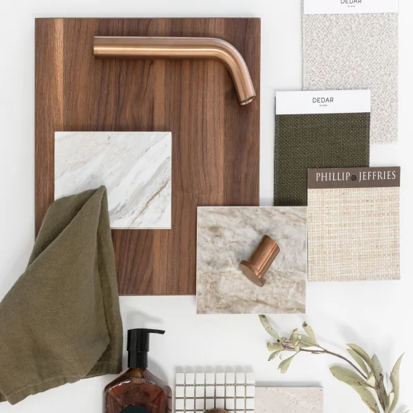
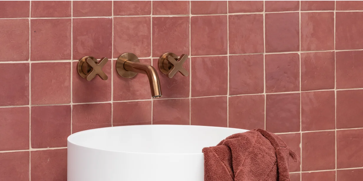
In our recent laundry renovation, the Elysian Kitchen Mixer, our tiles and some styling items like washcloths and towels were my mood board. I carried them around for weeks, and each new selection chosen had to work with those things. It helps make choosing easy.
Our home has feeling.
It’s like a warm embrace, full of heart, love and the most important people in my world. It’s where being with my family is the number one priority, and we can unwind and be ourselves regardless of what is happening in our lives. It’s a place where we are supported and encouraged. Our home is very private too, which is excellent for connecting and relaxing. Most definitely where the heart is ❤️ .


NOW GO & GET CREATIVE
As something deeply ingrained in the Australian aesthetic, the Coastal design scheme offers a world of possibilities while leaving room for personal interpretation. If you are considering a relaxed, Coastal design scheme, start with a base concept of something simple, like timber and neutral background, then, like Andy and Deb have done, begin building your home’s interior style from there. Add your chosen tones and textures and Coastal decor, while taking every opportunity for welcoming natural light. Make the most of your household structure and the lifestyle of those who occupy each space.
